
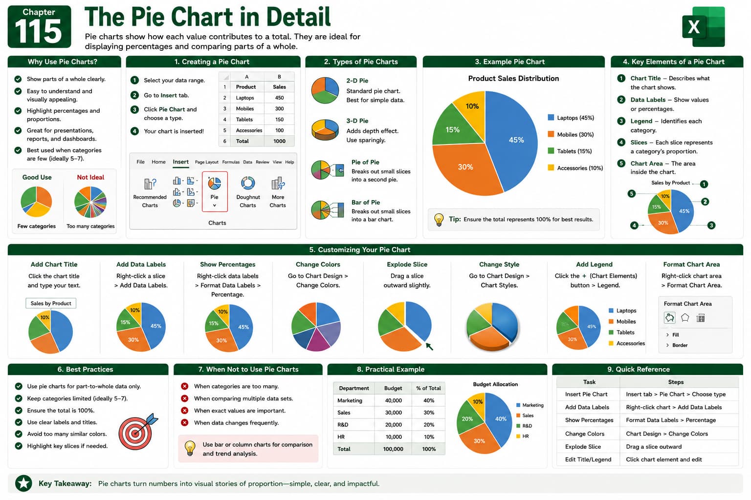
Chapter 115: The Pie Chart in Detail
Chapter Description
In this chapter, you’ll learn how to create and customize Pie Charts in Microsoft Excel to visualize data as proportions of a whole. You’ll explore different pie chart styles, formatting options, labels, legends, colors, and design features to present data in a clear and visually appealing way.
Pie charts are widely used in business reports, sales analysis, budgeting, surveys, and presentations to highlight percentage distributions.
What You’ll Learn
- Understanding Pie Charts
- Creating a Pie Chart
- Formatting chart elements
- Adding data labels and percentages
- Customizing chart colors and styles
- Exploding pie slices
- Choosing the right data for Pie Charts
- Best practices for effective data visualization
Learning Outcome
By the end of this chapter, you’ll be able to confidently create, customize, and format professional Pie Charts in Microsoft Excel, helping you present data clearly and make your reports more engaging and visually informative.