
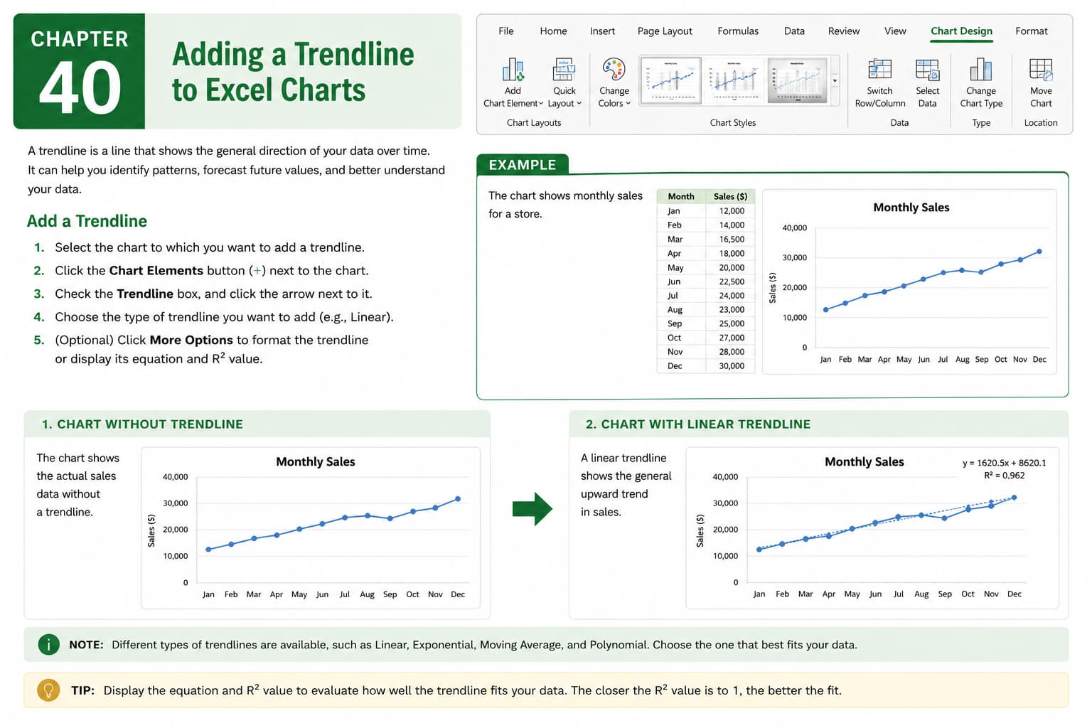
Chapter 40: Adding a Trendline to Excel Charts
Chapter Description
In this chapter, you’ll learn how to add a trendline to charts in Microsoft Excel to identify patterns, analyze trends, and forecast future values. Trendlines provide a visual representation of the overall direction of your data, making it easier to understand growth, decline, and relationships between variables.
You’ll explore how to add different types of trendlines, customize their appearance, display equations and R-squared values, and choose the most appropriate trendline for different datasets. You’ll also learn how trendlines can help improve data analysis and business decision-making.
This lesson is especially useful for analyzing sales performance, financial data, scientific research, marketing metrics, production reports, and forecasting future trends.
What You’ll Learn
- Understanding trendlines in Microsoft Excel
- Adding a trendline to an Excel chart
- Choosing different types of trendlines
- Formatting and customizing trendlines
- Displaying the trendline equation
- Showing the R-squared value on a chart
- Using trendlines for forecasting
- Best practices for effective trend analysis
Learning Outcome
By the end of this chapter, you’ll be able to confidently add and customize trendlines in Microsoft Excel charts, helping you identify data patterns, make accurate forecasts, and present meaningful insights through professional-looking charts.