
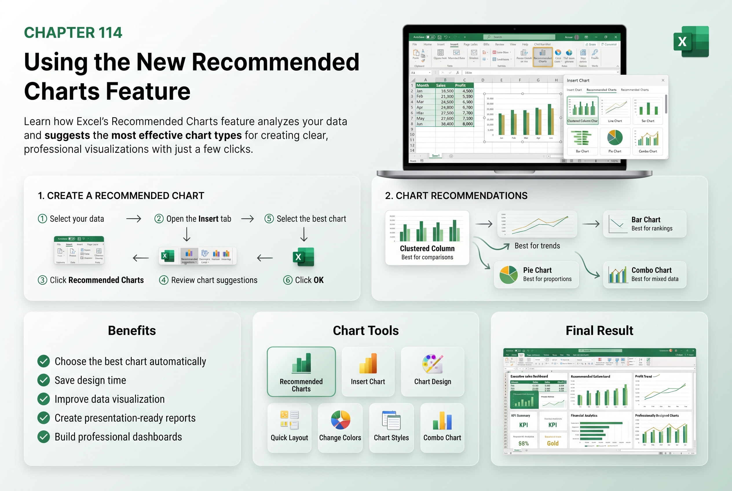
Chapter 114: Using the New Recommended Charts Feature
Chapter Description
In this chapter, you’ll learn how to use Excel’s Recommended Charts feature to quickly create effective data visualizations. Instead of manually selecting chart types, Excel analyzes your data and suggests the most suitable charts for better presentation and analysis.
You’ll explore different chart recommendations, customize charts, modify layouts, and understand when to use various chart types for different kinds of data.
This lesson is especially useful for business reports, dashboards, sales analysis, financial summaries, project tracking, and presentations.
What You’ll Learn
- Understanding the Recommended Charts feature
- Creating charts automatically from selected data
- Choosing the best chart type
- Customizing chart elements and layouts
- Editing chart titles, legends, and labels
- Switching between chart types
- Best practices for data visualization
Learning Outcome
By the end of this chapter, you’ll be able to create professional charts quickly using Excel’s Recommended Charts feature and present data more effectively.