Chapter 29: Summarizing Data Using a Sparkline
Chapter Description
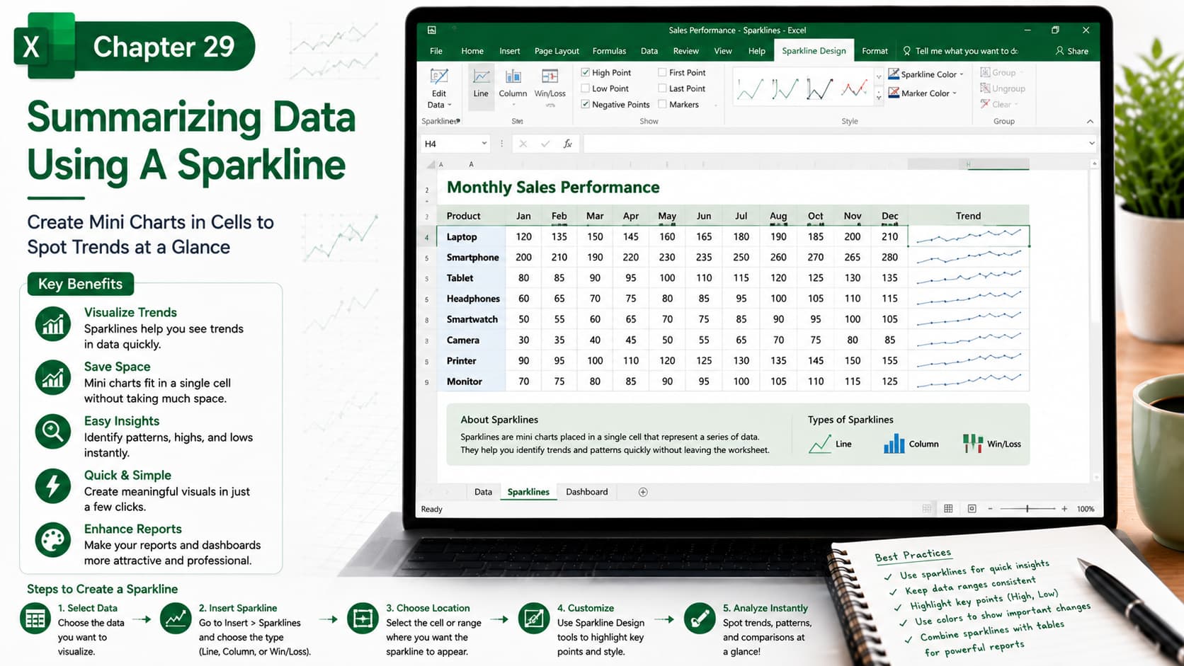
In this chapter, you’ll learn how to use Sparklines in Microsoft Excel to create compact, in-cell charts that visually summarize data trends. Sparklines provide a quick and effective way to analyze performance, identify patterns, and compare data without taking up much worksheet space.
You’ll explore the different Sparkline types—Line, Column, and Win/Loss—and learn how to customize them to highlight important trends, peaks, lows, and other key data points. This feature is ideal for dashboards, financial reports, sales analysis, and performance tracking.
What You’ll Learn
-
Understanding Sparklines in Excel
-
Creating Line, Column, and Win/Loss Sparklines
-
Displaying trends within individual cells
-
Customizing Sparkline colors and styles
-
Highlighting high points, low points, first and last values
-
Updating Sparklines automatically as data changes
-
Using Sparklines in dashboards and reports
-
Best practices for effective data visualization
Learning Outcome
By the end of this chapter, you’ll be able to create and customize Sparklines to summarize data visually within Excel cells. You’ll confidently identify trends, compare performance, and enhance your reports and dashboards with compact, informative charts that make data easier to understand at a glance.

