
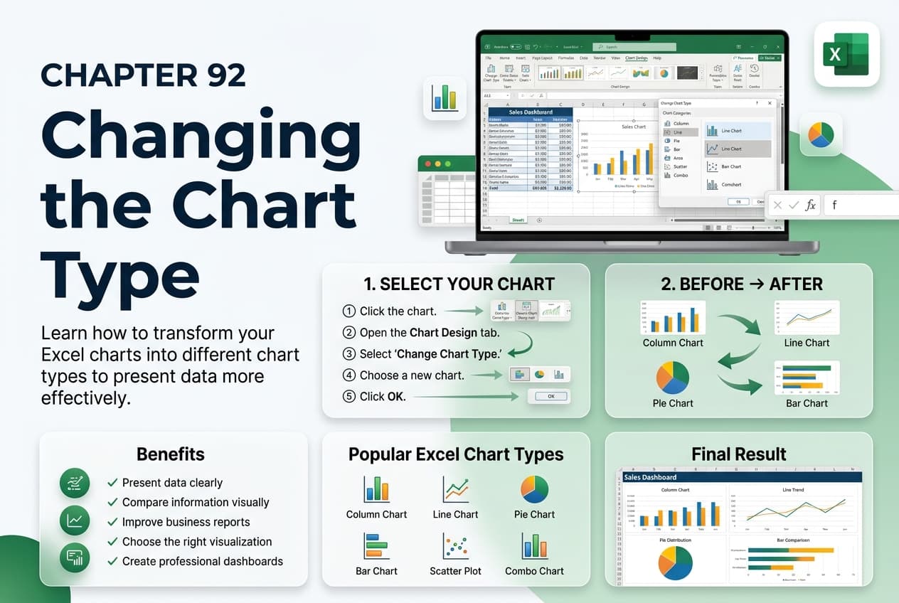
Chapter 92: Changing the Chart Type
Chapter Description
In this chapter, you’ll learn how to change the chart type in Microsoft Excel to present your data in the most effective and meaningful way. Different chart types are designed to highlight different aspects of your data, and selecting the appropriate chart can improve readability, emphasize trends, and support better decision-making.
You’ll explore how to switch between chart types without losing your data, compare common chart options such as Column, Bar, Line, Pie, Area, Scatter, and Combo charts, and understand when each type is most appropriate. You’ll also learn how changing the chart type can enhance data visualization and communication.
This lesson is especially useful for creating business reports, sales analyses, financial dashboards, performance summaries, project tracking reports, and presentation-ready charts.
What You’ll Learn
- Understanding chart types in Microsoft Excel
- Changing an existing chart to a different type
- Comparing common chart types
- Selecting the most suitable chart for different datasets
- Creating and using Combo charts
- Preserving chart formatting while changing chart types
- Improving data visualization through chart selection
- Best practices for presenting data with charts
Learning Outcome
By the end of this chapter, you’ll be able to confidently change chart types in Microsoft Excel, choosing the most appropriate visual representation for your data. You’ll create clearer, more informative, and professional charts that effectively communicate insights to your audience.