
Chapter 54: Creating a Chart Using the Long or Short Method
Chapter Description
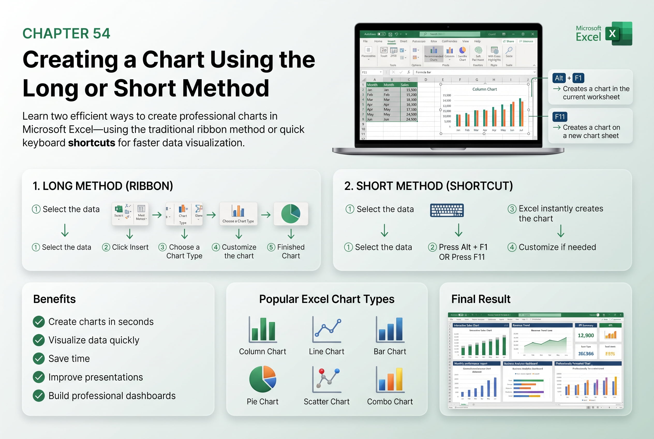
In this chapter, you’ll learn how to create charts in Microsoft Excel using both the long method and the short method. Charts are powerful visual tools that help transform raw data into meaningful insights, making it easier to identify trends, compare values, and communicate information effectively. Excel offers multiple ways to create charts, allowing you to choose the method that best fits your workflow.
You’ll explore the traditional step-by-step approach of selecting data and choosing a chart type from the Insert tab, as well as the quicker methods using keyboard shortcuts and recommended charts. You’ll also learn how to select the appropriate chart type, modify chart elements, and customize the appearance of your charts for professional presentations.
This lesson is especially useful for creating sales reports, financial analyses, performance dashboards, inventory summaries, project reports, and business presentations.
What You’ll Learn
-
Understanding chart creation in Microsoft Excel
-
Creating charts using the long (traditional) method
-
Creating charts using the short (quick) method
-
Selecting the appropriate chart type for your data
-
Customizing chart titles, legends, and axes
-
Applying chart styles and layouts
-
Editing and updating existing charts
-
Best practices for creating clear and professional Excel charts
Learning Outcome
By the end of this chapter, you’ll be able to confidently create charts in Microsoft Excel using both the long and short methods. You’ll choose the most effective chart type for your data, customize chart elements, and produce professional visualizations that enhance data analysis and communication.